—Case Studies
The need.
Sometimes our work is more about editing, curating and repurposing, rather than creating something new. This is such a project. Kew Student Residence lacked a clear and consistent visual identity, and were unable to effectively communicate their place in the market. One topped by esteemed University Colleges, and saturated at the bottom with low-cost apartment rentals.
Studio Constantine were initially approached to rework the enrolment materials for KSR, but we suggested that any materials needed a firm foundation to build upon, and so we proposed a consolidated visual identity as part of the project scope.
Our response.
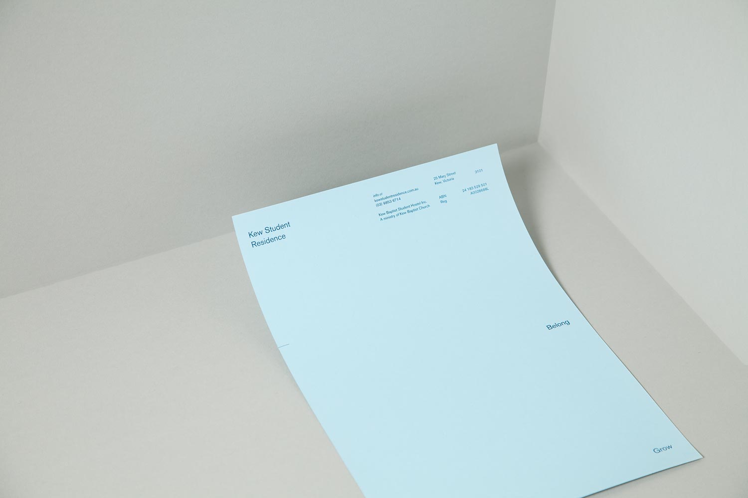
The core of the existing KSR visual identity was clear and simple, but in application, lacked imagination and a distinct personality. Studio Constantine first rationalised the various logotypes, symbols and colours into a single type family, a refined colour palette (with formulas that ensured consistency across all kinds of expression) and a set of logotypes that gave three distinct tones of voice for the different internal and external audiences.
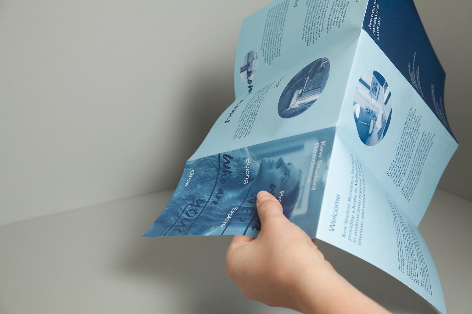
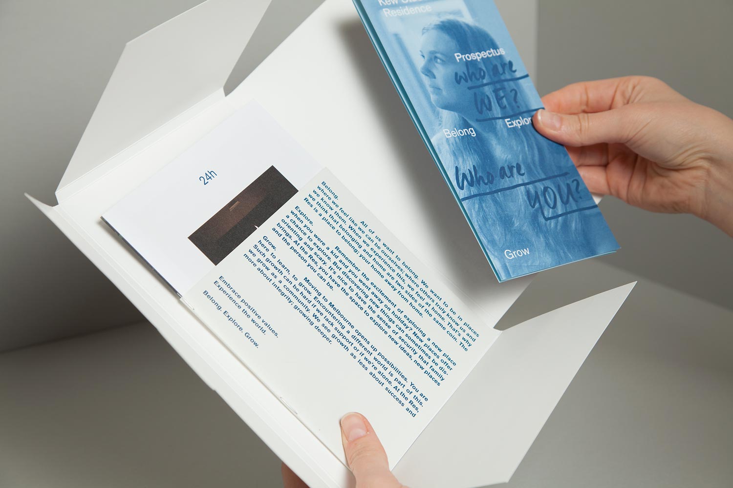
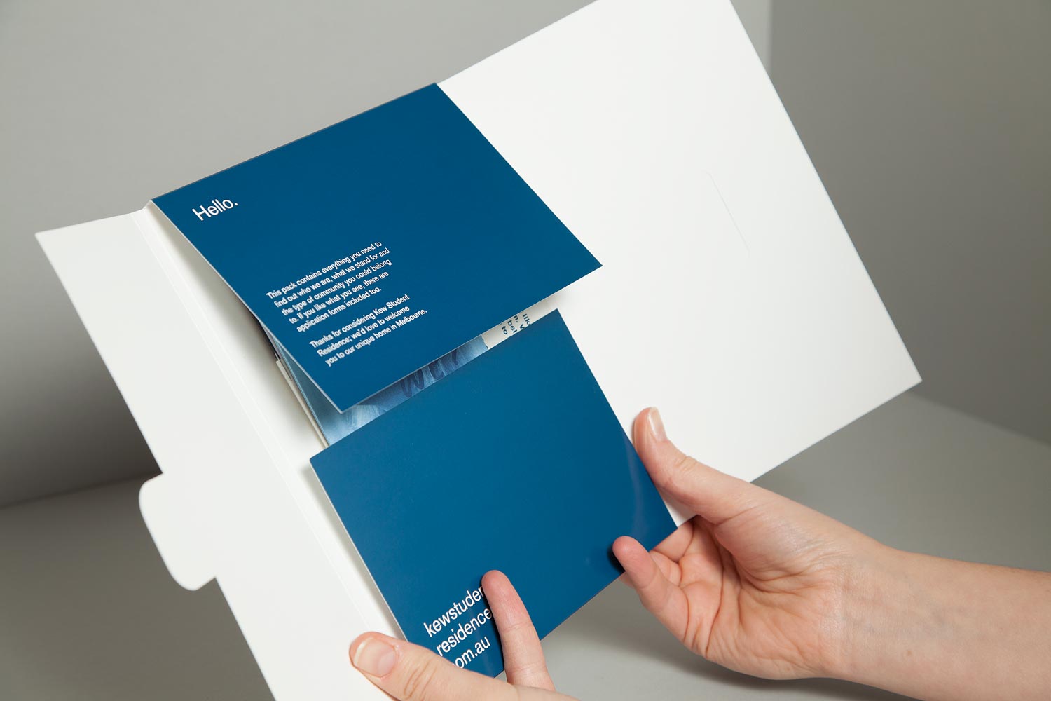
With the visual identity clarified, we created a prospectus / enrolment pack that could be sent to schools, community groups and careers advisers as an introduction to life at Kew Student Residence. Previous materials has been produced in-house, and used generic, pre-purchased stationery. Studio Constantine looked the current marketing budget, and proposed a set of materials that could be produced and used over two years, without increasing overall spend.
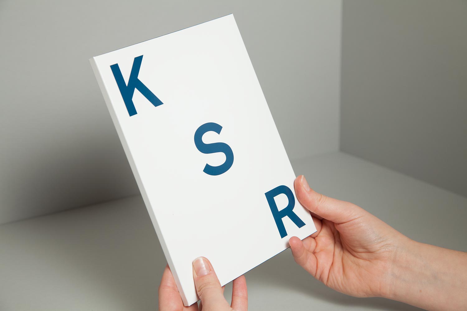
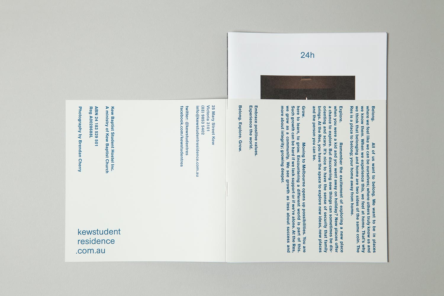
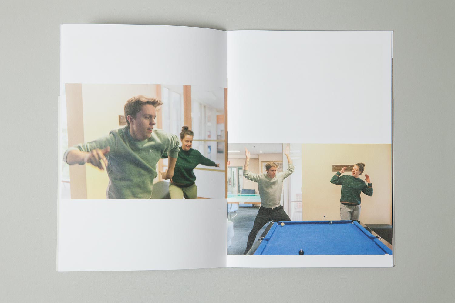
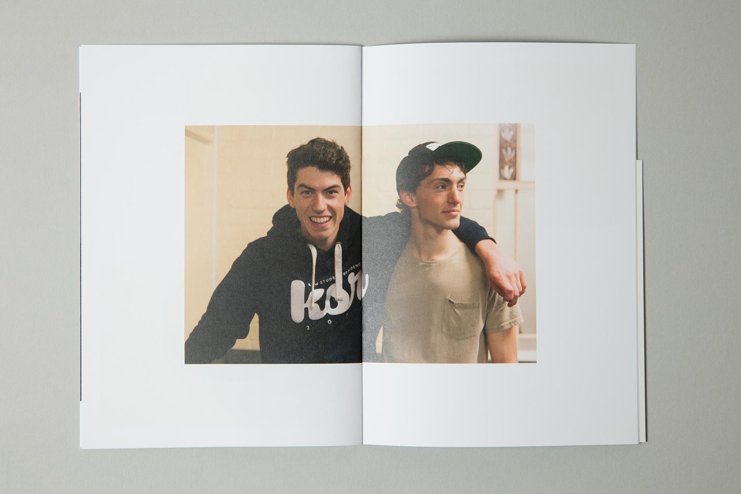
The packs are made up of the mailer folder (carrying KSR identity, and a note to the recipient), that can be filled, folded and mailed, a poster/brochure, for display in schools, and a photo essay, commissioned from current resident and photographer documenting 24h at KSR. The idea was that parents and schools would have a checklist of facilities and key information, handily available in the DL brochure, and the students would have a more emotive and immersive experience of Res life through the photo essay.
The application of a two-colour palette across the majority of the materials helped keep production costs low, but also placed the Kew Student Resident as an affordable, yet professional accommodation option, in a space awash with glossy prospectuses.
What happened next.
Interest and applications dramatically increased year on year, with a considerable wait-list being instituted for places before the end of the current calendar year. Schools and community organisations were actively requesting sets of documents to supply students with information. Following the success of the project, KSR managers approached Studio Constantine to consult on their Dining Space refurbishment.
Client Contact.
Anouchka Chatelier (Manager)
Kew Student Residence
25 Mary Street
Kew 3101
Australia
S.
C.
© 2011– Studio Constantine
